
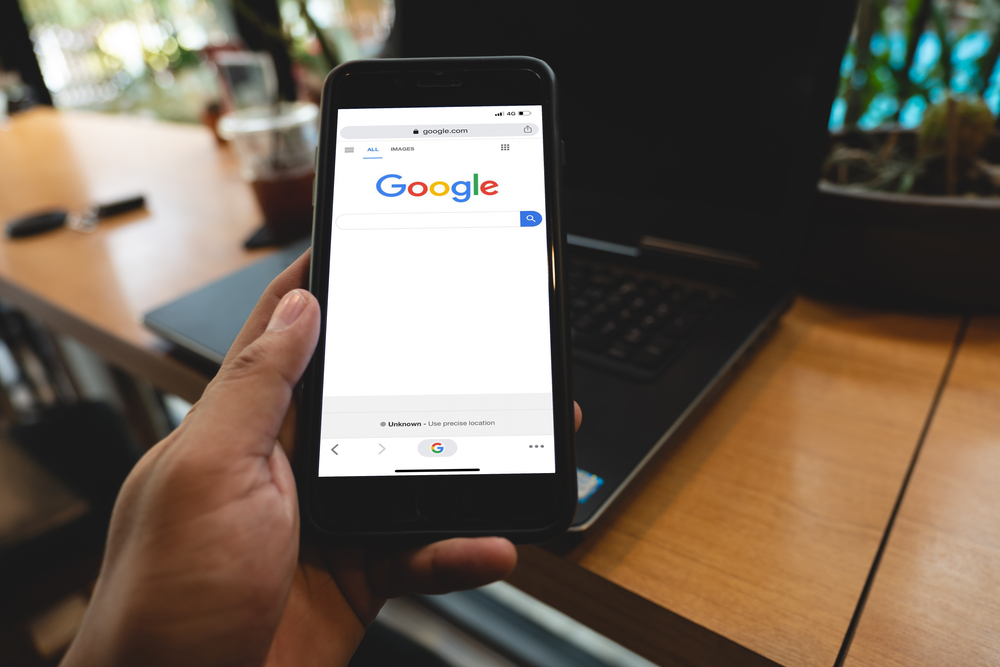
In case you hadn’t realised, Google is in the process of rolling out mobile-first indexing (MFI).
Originally, they were supposed to switch over to the mobile-first index in September this year (2020) but this has now been delayed until March 2021 – after all, it is a HUGE move and they have had a global pandemic to cope with in the meantime!
But what does mobile-first indexing mean for rankings? Should you be worried? Do you need to do anything? Google has been pretty vocal on all of this, so our SEO in the Manchester team has pulled together everything you need to know about mobile-first indexing.
What is mobile-first indexing?
Let’s go back to March 2018, when Google first announced they were going to start moving to mobile-first indexing. This was a reaction to the fact that their data was showing them that more and more people were using their mobile devices to search – rather than a laptop or desktop. We all have smartphones in our pockets now, which we pull out whenever we need to know something – so it makes sense that Google would react to that and start to prioritise mobile results over desktop.
What this means is that from March 2020, Google’s index will switch over from desktop to mobile – and so no matter what device you search on, the search results page’s you are presented with will be based on the mobile version of your website.
Tip One: Don’t worry
Whenever Google announces big changes like this, a lot of people’s first reaction is to panic! But there is no need to – it is not actually that big of a change and it may have no impact on your rankings whatsoever. If you work with great website design and local SEO manchester company like SEO MCR then your website will already be based on responsive design – so both your desktop site and your mobile site will display the same content.
If you have two different site designs, however, one for desktop and one for mobile – then you may notice a drop in rankings, especially if your mobile site has less content on it. Your desktop and your mobile site should have exactly the same content – including meta title and descriptions, robots meta tags, and structured data – this is known as mobile parity.
While we are on the subject of mobile sites, it is also worth you knowing about the upcoming page experience update by Google as well – which is all about user experience (obviously), with speed and mobile-friendliness being two of the signals that Google will use to index your website.
Tip Two: Check out the results of a mobile-friendly test
If you don’t have a mobile site, then don’t worry too much as Google will still rank your desktop site – it will just mean it is harder to rank well if your desktop site is not mobile-friendly. So, knowing whether your site is mobile-friendly or not is quite important.
You can test this out using a Google tool (surprise, surprise) called the “mobile-friendly test” which will give you a fair idea of whether your site is OK or whether you need to make some tweaks. Of course, you can always leave it to us – as we are well versed in Google’s documentation on what they want from a mobile site.
Tip Three: User experience is key
Your mobile website will need a different design approach than your desktop version in order to appeal to your customers. Think about it – on mobile the screen is tiny! Don’t be fooled into thinking this means the best thing to do is to get rid of content though – Google definitely does not see this as best practice.
Hamburger or accordion menus are fine to use, as long as you leave enough space between menu items for those of us with fat fingers to press the menu item we want easily. If you really want to reduce the amount of content on your site down, then put it behind a menu tab rather than getting rid of it altogether – Google would prefer this.
Tip Four: Make sure your content is mobile-friendly
Reading on a screen is harder than on paper – and reading on a mobile-sized screen is harder than reading on your desktop. So, when you want to attract a mobile audience to read your content, you need to make sure it is short and compact, and that you use a large enough font to be clear. Make good use of white spaces too.
Tip Five: Optimise your mobile snippet
If your audience is mostly mobile and comes from mobile search results to your website, then you are already doing well. You can check whether this is the case or not in Google Analytics. One thing you need to make sure you are doing is optimising your mobile snippet on any content you write, and not your desktop snippet – as this will really help to draw in your target audience on mobile.
Conclusion
If your mobile site has a responsive design already, then your content will be similar on desktop and mobile and so the mobile-first indexing should have little impact on your rankings – once all sites are moved over in March 2021.
If you want to make sure your mobile website is optimised or have a question about local search engine optimisation Manchester, then get in touch with SEO MCR – we are a result-driven SEO agency with a proven track record for getting results.
